The Center of Orange 36" x 36"
The Center of Orange 36" x 36"
See more paintings from the Floating Color Collection.

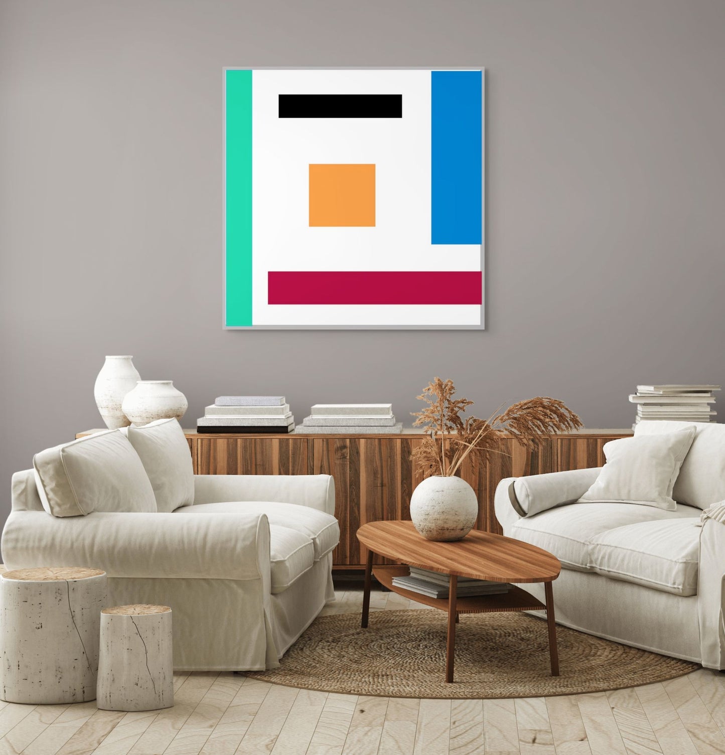
James Nowak’s The Center of Orange, part of his Floating Color Collection, exemplifies the artist’s ability to create meaning through simplicity, balance, and color relationships. This work highlights an orange square as its conceptual and visual nucleus, around which other geometric forms orbit. Through this central motif, Nowak transforms a minimalist arrangement into a meditation on warmth, balance, and the dynamic interplay of forces within abstraction.
At the heart of the composition lies the orange square, positioned centrally yet slightly elevated within the canvas. Its placement establishes it as the gravitational core of the work. Surrounding it are five distinct geometric elements:
- A black horizontal bar near the top introduces weight and visual gravity.
- A teal vertical bar on the far left creates an edge-boundary, framing the space.
- A blue vertical rectangle on the right extends upward, balancing the teal’s presence while providing coolness against orange’s warmth.
- A deep red horizontal bar at the bottom anchors the painting, evoking stability and grounding.
- The white background functions as atmosphere, amplifying the floating sensation of the forms.
The orange square serves as the balancing mediator among these forces. Unlike The Power of Red or Yellow Square, which emphasize dominance, The Center of Orange emphasizes relational harmony, with orange acting not as conqueror but as connector.
Orange is the work’s thematic and emotional center. In color theory, orange is often associated with energy, warmth, and creativity—qualities that Nowak channels here. The square’s modest scale compared to surrounding bars underscores its symbolic role: small but pivotal, luminous yet humble.
Placed at the center, it radiates outward, linking the oppositions of black and white, cool and warm, vertical and horizontal. It becomes the painting’s “pulse,” a reminder that balance can emerge from a vital center rather than from symmetry.
The palette is carefully tuned to highlight contrast and interplay:
- Orange: the warm core, energetic yet stabilizing.
- Black: introduces seriousness and weight, contrasting orange’s vibrancy.
- Red: grounds the bottom of the composition, echoing warmth but with deeper intensity.
- Teal and blue: provide coolness, counterbalancing the heat of orange and red.
- White: the neutral void, a space of suspension where all colors interact.
This interplay elevates orange beyond simple hue—here it is mediator, synthesizer, and reconciler of extremes.
Consistent with the Floating Color Collection, the shapes appear suspended in space. The white background functions not as emptiness but as atmosphere, allowing the forms to hover. The orange square, despite being the center, floats lightly, refusing to become static or heavy.
This creates an illusion of both stillness and motion: the orange square anchors the eye while the surrounding bars seem to push, pull, and orbit around it.