Peace and Harmony 36" x 48"
Peace and Harmony 36" x 48"
See more paintings from the Floating Color Collection.

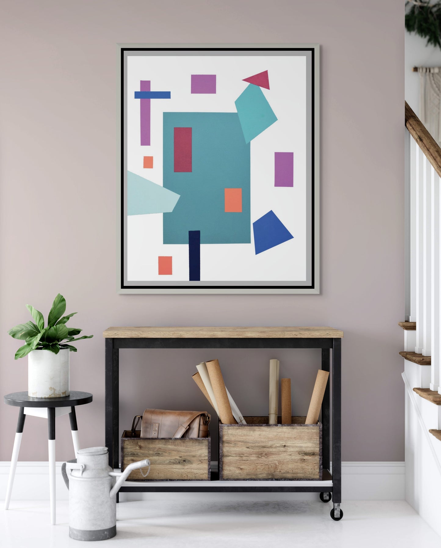
James Nowak’s Peace and Harmony, part of the Floating Color Collection, explores the interplay of geometric abstraction and chromatic balance. At first glance, the composition may appear as a playful arrangement of shapes, yet beneath its simplicity lies a carefully orchestrated meditation on order, balance, and coexistence. The painting serves as an abstract inquiry into how discrete and often contrasting elements can inhabit a shared visual space without conflict.
The work is dominated by a large teal quadrilateral at the center, functioning as an anchor around which other shapes orbit. This central figure suggests a grounding presence—perhaps a metaphor for stability or unity—while the surrounding polygons, rectangles, and trapezoids create a dynamic rhythm across the canvas.
The arrangement defies symmetry yet achieves harmony through deliberate placement. The tilted turquoise polygon leaning into the red triangle at the top-right suggests tension and movement, but their balance prevents disruption. On the left, the vertical purple and horizontal blue bars intersect like a cross, evoking themes of connection or intersectionality within the broader whole.
By distributing shapes across multiple axes without crowding the canvas, Nowak preserves a sense of openness, allowing each form to maintain its individuality while contributing to the collective.
Color is the painting’s primary vehicle of expression. The palette juxtaposes cool hues (teals, blues, purples) with bursts of warm tones (oranges, reds). The cooler shades evoke calmness and introspection, while the warm tones interject energy and vitality.
The dialogue between these opposites encapsulates the painting’s title: Peace and Harmony. Rather than competing, the warm and cool colors coexist, creating visual balance. The orange rectangles, for instance, stand out against the teal field but do not overwhelm it; instead, they provide rhythm and emphasis. Similarly, the interplay of red and purple with blue and turquoise produces vibrational contrast without discord.
Though abstract, the work resonates with symbolic undertones. The geometric shapes can be interpreted as individuals, communities, or ideas—distinct in form, yet interdependent in composition. The absence of organic curves underscores the intentional rigidity of structure, as if to suggest that harmony requires boundaries and order.
The title directs the viewer to read the piece as more than an exercise in abstraction: it becomes a philosophical statement. The canvas suggests that peace does not arise from uniformity but from negotiated balance among differences. In this sense, the work can be seen as a visual allegory of social harmony, where contrasting identities coexist in structured yet flexible relations.
Unlike strict grids or color-field experiments, Nowak embraces irregularity and asymmetry. The Floating Color Collection title hints at this departure: the shapes do not lock into rigid frameworks but instead “float,” echoing the fluid, often precarious nature of balance in both art and life.
Critically, the work invites reflection on how abstraction communicates universal themes. By stripping away figuration, Nowak distills the essence of coexistence to its formal elements: color, space, and proportion. This reduction allows for multiple readings, from purely aesthetic to deeply philosophical.
James Nowak’s Peace and Harmony exemplifies the power of abstract art to express complex emotional and social ideas through seemingly simple forms. The careful orchestration of shape, color, and spatial tension transforms the canvas into a meditation on coexistence and equilibrium. Within its quiet geometry lies a profound reminder: harmony is not the absence of difference, but the artful arrangement of contrasts into a balanced whole.